Brand Identity
Riverside Kapital
Specialized real estate services company for high-net-worth business leaders (income over $10M).
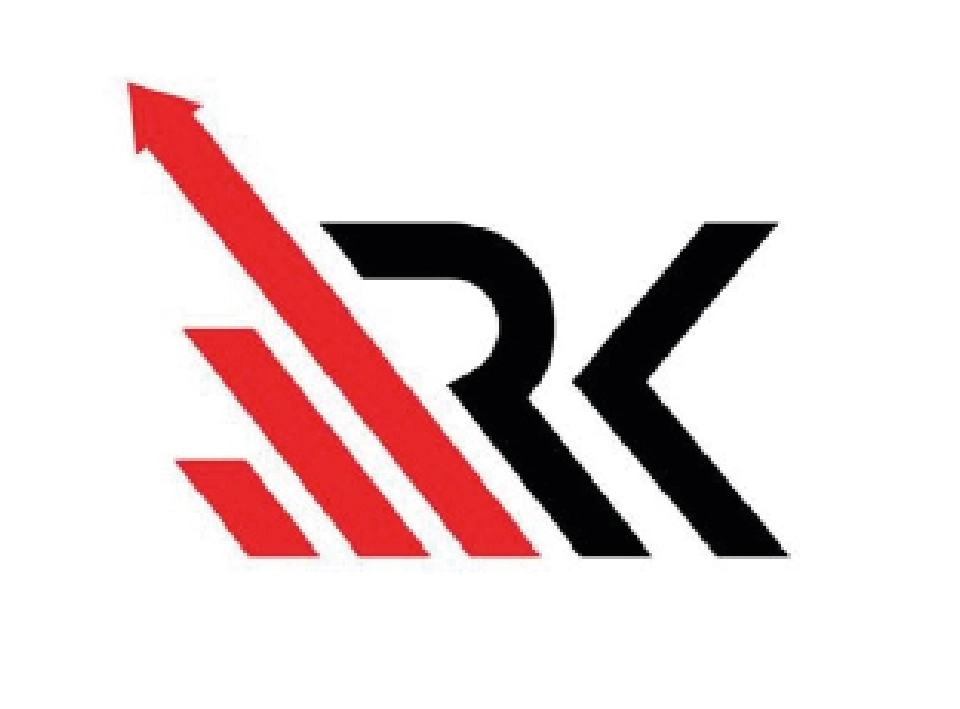
The current brand symbol suffered from a disconnect between its visual identity and corporate values. The legacy logo—featuring red arrows associated with dynamism—conveyed urgency and aggressiveness, contrary to the serenity and elegance they aimed to project.
The challenge: Create a symbol that would serve as an emblem of authority in a highly competitive market.
Mission
Replacing a timeless, reflective, and trustworthy visual identity, the Delaware Shore, with prestigious capitals like the United Nations and the Delaware brand, a solid, institutional, and strategic partnership for elite entrepreneurs.
Strategic Concept
Identity was built on a key duality:
1. “Unbreakable Professionalism”: Transmit solidity through structured lines and a sober palette.
2. “Elite Versatility”: A system adaptable to diverse contexts, from legal documents to luxury items.
Design Challenge
The existing logo created two critical problems:
. Lack of strategic alignment: Red and arrows associated the brand with financial risks, moving away from the serenity required at Riverside Kapital
. Outdated Aesthetics: A generic visual proposal that did not resonate with high-purchasing audiences, who prioritize discreet elegance and exclusivity.
The goal was to create an iconic symbol that encoded values such as stability, legacy, and privileged access, eliminating distracting elements.
Solution
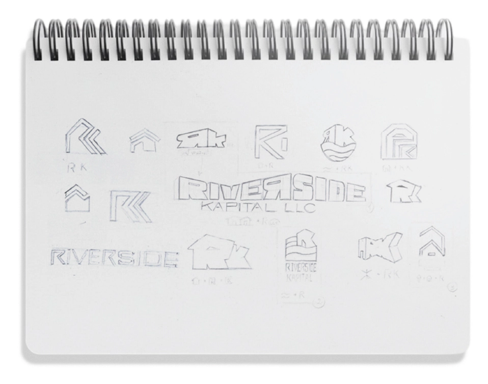
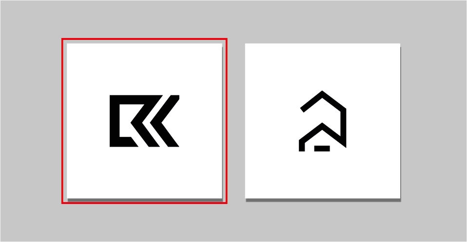
RK monogram:
. Typographic fusion of the initials with blue lines that suggest solidity and structural location).
. Precise spacing to guarantee readability on small scales (visiting cards) and large formats (external advertising).
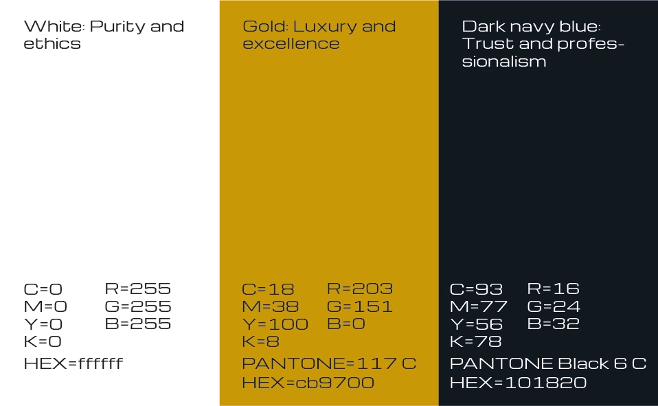
Strategic Palette:
. Dark Marine Blue (# 0A1D3C): Professionalism and trust.
. Golden (# B8975A): Excellence and discreet luxury.
. White: Purity and operational transparency.
Adaptive Brand System:
. Institutional Version: Complete logo for formal and digital documents.
. Simplified Isotype: “RK” acronyms without text for exclusive items (VIP cards, luxury merchandising).
Elimination of Contradictory Elements:
. Arrow suppression and visual dynamism to prioritize typographic cleaning and strategic negative spaces.
Tools and Deliverables
Software:
. Adobe Illustrator (vector design),
. Photoshop (contextual mockups),
Delivered Formats:
. SVG, (vector) PNG (transparent), JPG (high resolution).
Results
. Immediate Recognition: The RK isotype was adopted as a status seal in business circles, even in non-financial contexts.
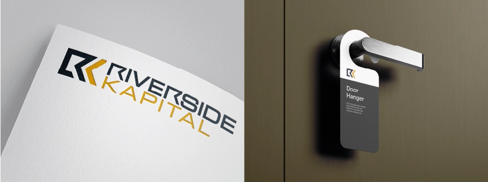
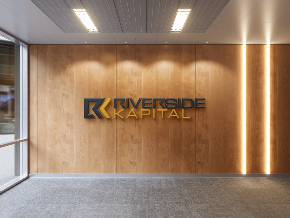
. Multichannel Coherence: Uniform implementation in all supports, from annual reports to signage at corporate headquarters.
. Strategic Flexibility: Identity supported Riverside Kapital’s international expansion without requiring redesign.
Technical Sheet
Client: Riverside Kapital
Sector: Corporate Consulting & Heritage Management
Service: Basic Bisual Identity Design
GraphicStones Team: César (Creative Direction), Alejandro (Strategic Design), Kike (Digital Implementation)
Key Concept: “Elegance with purpose”
