Brand Identity
Game Shop
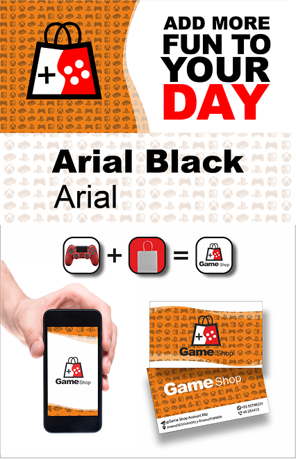
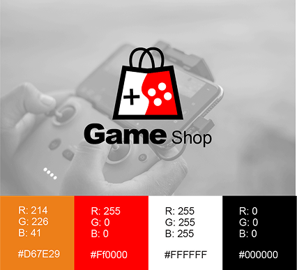
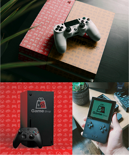
Branding project for Game Shop, a video game store that seeks to establish itself as a community hub for gamers of all levels. The visual identity combines playful energy with modern sophistication, integrating elements that celebrate genre diversity (from casual games to eSports) and reflect a passion for gamer culture. The design prioritizes versatility to work in both physical environments (stores, events) and digital environments (social media, streaming platforms).
Mission
Position Game Shop as an inclusive and vibrant space that connects casual gamers, collectors, and competitors, reinforcing its role as a key meeting point for the local gaming community. The brand had to convey technological innovation and retro nostalgia simultaneously, honoring the historical evolution of video games.
Strategic Concept
. Gamer inclusivity: Visually unifying opposing segments (casual vs. hardcore) through universal symbols (controllers, genre icons).
. Technological dynamism: Use of neon gradients and moving geometric shapes to evoke modernity and action.
. Controlled nostalgia: Subtle integration of retro elements (pixels, 8-bit palettes) reinterpreted with contemporary techniques.
. Community first: Graphics that emphasize social interaction (group avatars, tournaments) and not just products.
Design Challenge
. Fragmented audience: Attract casual gamers (who prefer accessibility) and hardcore gamers (who seek exclusivity) without alienating either.
. Saturated competition: Differentiate from other stores with generic, cliché-based identities (gamepads, bursts of color).
. Cross-platform adaptability: Maintain visual consistency across contrasting media (e.g., physical posters vs. animated Twitch banners).
. Legibility in small spaces: Ensure the logo and graphics are recognizable even at small sizes (such as product labels).
Solution
. Modular Identity System:
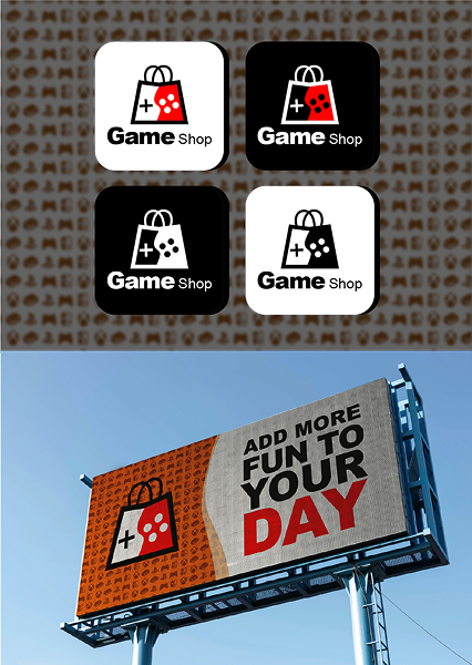
. Responsive Logo: A full version (icon + text) for the physical store and a simplified version (dynamic icon) for social media.
. Flexible Iconography: A set of genre-inspired icons (RPG, FPS, indie) that function as emojis in digital communications.
. Dual-Personality Palette:
. Vibrant neon (electric magenta, cyan) to appeal to young people and streamers.
. Deep dark tones (graphite black, purple) to convey sophistication to collectors.
. Moving Geometric Motifs: Hexagonal patterns that simulate network connections (community) and are digitally animated to generate dynamism.
. Hybrid Typography: A modern sans-serif font with pixelated details in key letters, merging retro and futuristic.
Tools and Deliverables
. Tools: Adobe Illustrator (vector design), After Effects (animations), Blender (3D for merch visualizations).
. Key deliverables:
Responsive logo system (4 variants: static, animated, monochrome, retro).
. Interactive brand guide (PDF + microsite with animated examples).
. Social media templates (stories, banners, stream overlays).
. Merchandise design (T-shirts, mugs, keychains with custom icons).
. Physical store signage (LED lighting integrated with branding).
Technical Sheet
. Client: Game Shop
Industry: Video Game Retail Gaming Community
. Services applied: Visual Identity, Logo Design, Strategic Branding, Signage
. Duration: 10 weeks
. Team: César (Graphic Design), Kike (Web Design/Animation), Alejandro (Strategy)


