Brand Identity
SoyAlejandroPons
Visual identity project for SoyAlejandroPons, a personal graphic design mentoring brand aimed at aspiring designers and freelancers looking to become professionals. The identity fuses minimalist sophistication with motivational energy, using the mountain as a central symbol to represent perseverance, gradual growth, and the achievement of creative goals.
Mission
To position Alejandro Pons as a trusted guide in the world of graphic design, combining his technical expertise with a friendly, educational approach. The brand needed to communicate professional authority (to attract companies) and inspirational empathy (to connect with budding designers).
Strategic Concept
Visual metaphor of the mountain: Symbolizes the creative journey (base = learning, summit = professional success).
Dual audience: Adaptable visual language to convey seriousness to businesses and accessibility to beginners.
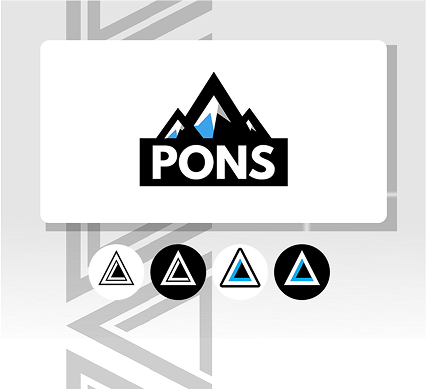
Three-pillar philosophy: Learn, Create, Monetize, reflected in the three peaks of the logo and the triangles of the identity.
Energetic minimalism: Clean lines and contrasting colors to avoid visual saturation while maintaining dynamism.
Design Challenge
Segmented audience: Unify the message for two opposing audiences (newcomers vs. businesses) without losing coherence.
Non-literal symbolism: Avoid clichés of “success” (trophies, cups) and represent the mountain in an abstract but recognizable way.
Technical scalability: Ensure that the logo system is legible in extreme formats (billboards vs. 64×64 px avatars).
Solution
. Modular Logo System:
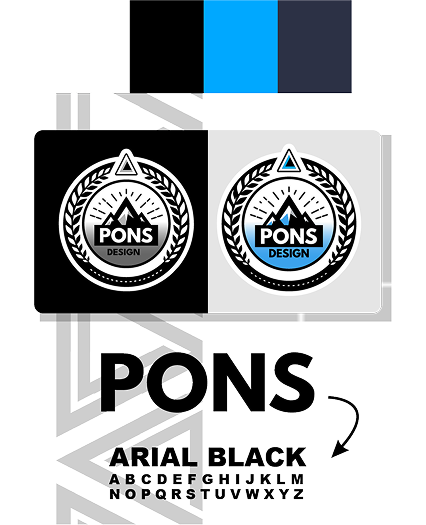
. Complex Variant: Circular emblem with laurels (achievement) + compass (guidance) + stacked triangles (progress).
. Simplified Variant: Three minimalist mountains + custom geometric typography for corporate use.
. Social Media Variant: Compact triangle icon (cyan/black) optimized for instant recognition.
. Strategic Palette:
. Cyan: Creative energy and clarity.
. Black/White: Timeless contrast to suit professional or inspirational contexts.
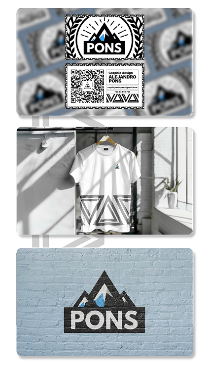
. Abstract Triangular Patterns: Used in presentation backgrounds, educational templates, and merchandising to reinforce the theme without being redundant.
. Dual Typography: Geometric sans-serif (headings) for modernity + organic typography (body) for approachability.
Tools and Deliverables
. Tools: Adobe Illustrator (vector design, brand manual), Photoshop (digital applications).
. Key deliverables:
3 logo variants (AI, PNG, SVG).
. Visual identity manual (40 pages).
. Templates for social media, presentations, and online courses.
. Corporate stationery kit (cards, envelopes, folders).
Technical Sheet
. Client: Alejandro Pons (Personal Brand)
. Industry: Graphic Design Education / Mentoring
. Services: Visual Identity, Logo Design, Strategic Branding
. Duration: 8 weeks
. Team: César (Graphic Design), Alejandro (Creative Direction)


